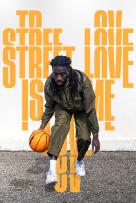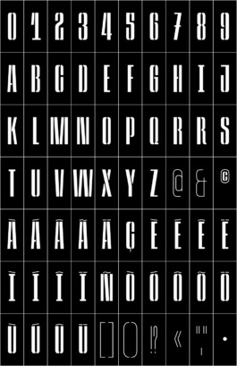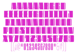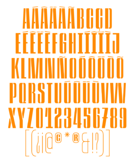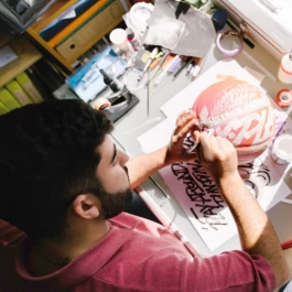


I'm João, a Lettering Artist and Type Designer based in Lisbon. My world is divided between hand-painted letters and sharp digital designs. I love to work with letters of all shapes and sizes, in all mediums and colours, from typefaces and logos to murals and calligraphy.
It all started in a narrow alley behind my elementary school. A suspicious look to check no one was coming, a deep breath and three minutes of pure anxiety. That was the first time I painted graffiti on a wall, and while the outcome wasn’t remotely satisfactory, it felt like no other thing.
Years went by and my passion for graffiti got serious, but it wasn’t until I enrolled in an arts and design high school in Lisbon that I realized my love for graffiti wasn’t just a rebellious phase, and it wasn’t a love for adrenaline and running from cops either...
... it was all about the letterforms.
Since then, my world has revolved around letters of all shapes and sizes, in all mediums and colors. Attracted to everything related to typography, from typefaces and logos to murals and calligraphy, I constantly challenge myself to work with different materials, scales and styles.
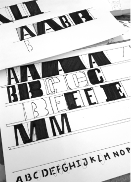
In 2020, I graduated with honors from the Master Type Design at École Cantonal d’Art de Lausanne. There I learned to merge the technical and detailed Type Design process with an expressive and creative approach to lettering pieces. My creative process always involves analogue and digital techniques, usually combining both for the finished artwork.
Handmade or digital, creative or technical, artistic or functional, are the dualities that mark me as a creative.
I’m always thrilled to join projects in which I have the opportunity to draw, paint, build and work with letters!
Don’t hesitate to reach out if you want to collaborate, share an idea, or just to chat.
• Slanted Yearbook of lettering
• Slanted nº42 "books"
• Typism book 5
• Typism book 8
• Écal Type Bulletin 2021
• Tramontana 04
• Optimum Type
• Nuba Mag
Amoreiras Shopping Center
Betclic
Cais association
CAS Studio
Cereveja MUSA
Circus Netwrok
Crackids
Crate Records
Doca de Santo F&B Group
Domestika
Esporo Cultura
Fazunchar
Galeria de Arte Urbana
Gerador Cultural Platform
Homem em Catarse
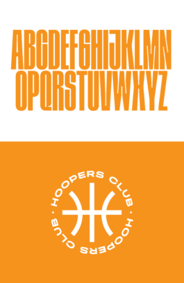
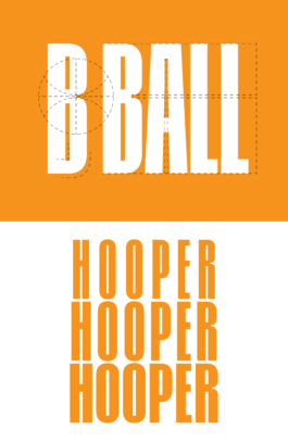
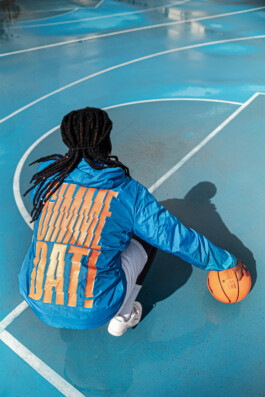
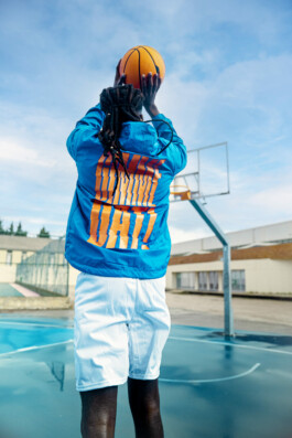
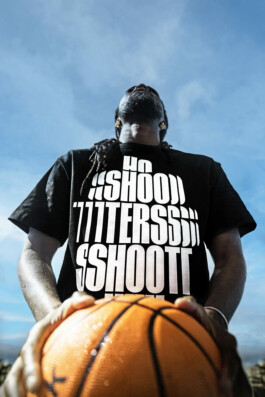
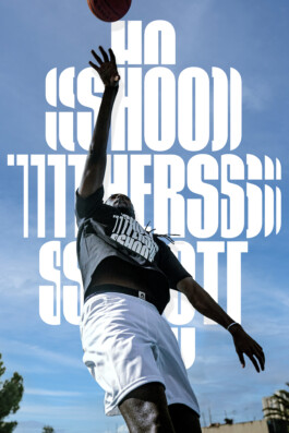
HOOPERS Club
IDB -Innovation Design Building Lisbon
Lisbon City Hall
Lola Normajean
Mistaker Maker
Mundi Center
MUSEU DO DESIGN E DA MODA - Mude
Netinvoice SA.
No-Walls
Oeiras Valley
Paralelo20 - Theather Company
Pestana Hotel Group
Plano B - Club
Polyester Animation Studio
Quadrilátero Cultural
SkateArt
The Hood
Ubbo
Under Dogs Gallery
V-I-A
Well Rounded Design
Wool - Covilhã Arte Urbana
• Introductory class to Lettering at ETIC 2022+2023
• Image Lab at ESAD.cr 2023
• Expressive Calligraphy - Domestika Course
• Workshop Neon Type 2023
• Workshop Street Art "25 Abril" 2022
• Workshop Street Art "MURO" 2021
• Cais Urbana [2019]
• Not So Street Art [2022]
• Amoreiras Creative Hall [2022]
• New Year’s Solutions, at Crackids [2023] [Solo Show]
• Liga Betclic // Art Dunk prod by Underdogs Gallery[2023]
• 14 Years of Crack, IDB Lisbon [2023]
• Festival Infinito - Cascais [2023]
• Caminhos Literários - Abrantes [2022]
• MURO 2021 - Lisboa [2021]
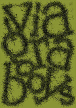
• VIA Valongo - Valongo [2021]
• No Walls - Oeiras [2021]
• Fazunchar - Figueiró dos Vinhos [2019]
Website developed using Laytheme. Set in Space Grotesk by Florian Karsten.
© João Varela, All Rights Reserved
